
Oppenheimer
A groundbreaking virtual cinematic journey
Client
Universal
Agency
BOND
Services
Creative Direction
Ideation
UI/UX
Building Los Alamos
At the heart of Oppenheimer is the impossible task: building a secret city in the desert to change the course of history. We set out to echo the film’s narrative in our medium. We didn’t just design a website. We built Los Alamos.
A fully realized, 3D environment rendered in WebGL allowed users to traverse the city, uncover characters, and experience the magnitude of what was created in the New Mexico desert.
The digital space became both metaphor and mechanism: a living embodiment of ambition, tension, and consequence. Where the film constructed a world for the screen, we constructed one for the web to mirror the narrative build.
Progress accumulating. Pressure mounting.
A spark turning into something unstoppable.
Research & Place
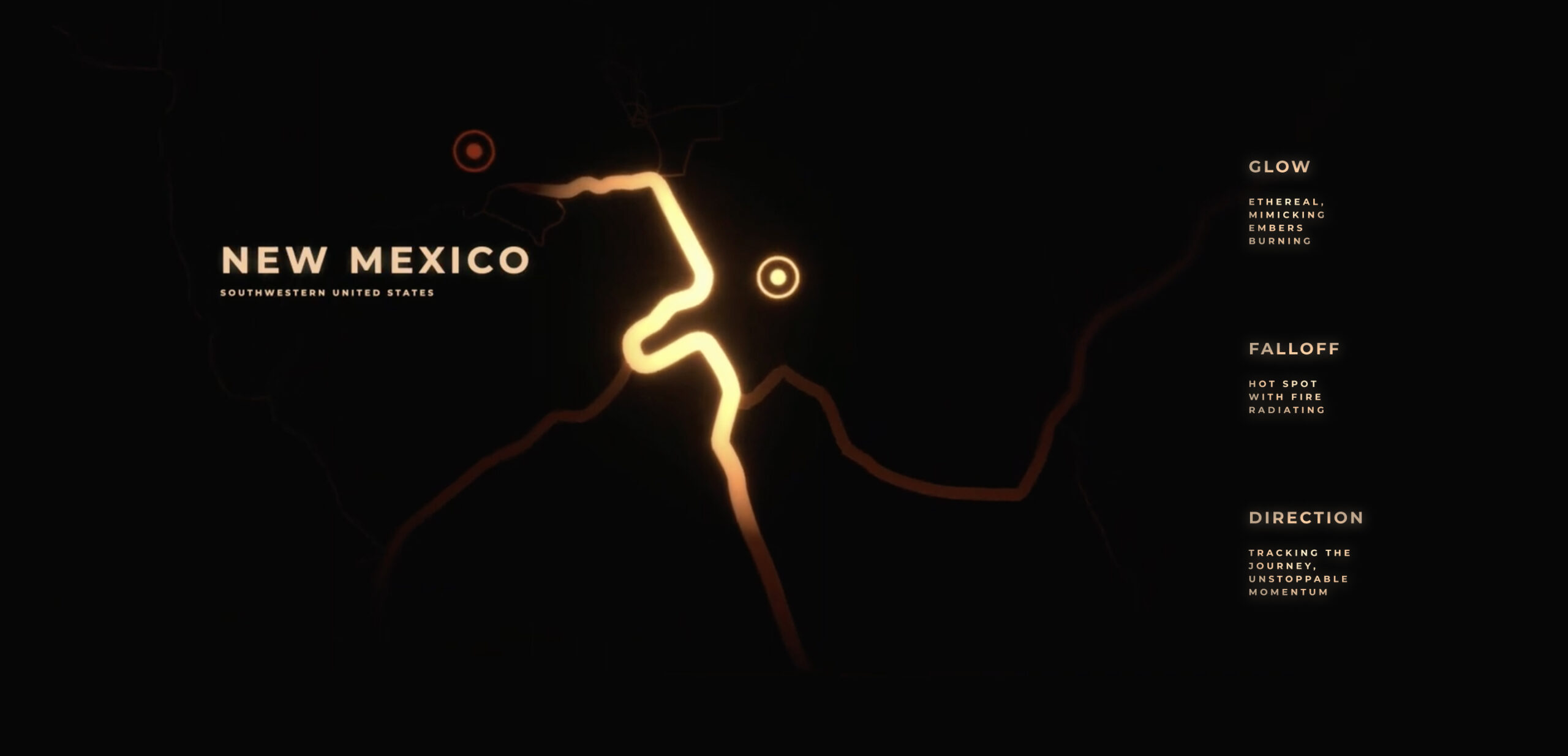
Authenticity began with research. We studied historical maps, archival photography, and documentation to reconstruct the spatial logic of Los Alamos. Specific locations featured in the film were mapped accurately in relation to one another. UX was shaped by geography. Narrative was shaped by movement through space. Users do not click through pages. They traverse a city. Golden fiery roadways guide exploration.
In order to achieve this UX we needed to research maps both modern and historical and plot the various sets in relation to the space. This allowed us to highlight that scale of Los Alamos: seeing not just each vignette, but allowing the camera to elevate out of the scene into an omniscient aerial perspective and into the map view. From there there user could see the scale of the town as they navigated to the next vignette.
A City on Fire. A City About to Erupt.
Visually, the world of the site lives in a state of ignition. Golden roads glow like veins of heat cutting through the shadowed floor. Orange light emanates from the buildings as if something inside is burning brighter than it should. Architecture does not simply sit in space. It emerges from darkness. Forms reveal themselves gradually, as though illuminated by distant flame.
This aesthetic nods directly to the film’s thematic arc. A spark of discovery. A theory becoming reality. Progress accelerating toward consequence. The city feels alive. Not destroyed, but charged. On the brink. The atmosphere suggests combustion without explosion. The tension exists in that suspended moment before eruption. Light becomes narrative. Heat becomes metaphor.
Prestige by Design
The film carries immense pedigree. The subject matter is academic, historical, and morally complex. The director, Christopher Nolan, represents a level of craft and seriousness rarely matched in contemporary cinema.
The design language needed to reflect that prestige.
Gold texture was introduced into typography and key visual moments. This was not decorative gold. It was a fire texture so hot it burns almost white. It glimmers. It feels refined yet volatile.
The result creates a powerful dichotomy: Gold as achievement, academia, awards prestige vs. fire as volatility, destruction, moral cost.
This tension reflects the film itself. The pursuit of knowledge. The price of progress. The glow within the letterforms feels elevated and institutional, almost academic. At the same time, it suggests something unstable beneath the surface. Prestige built on combustion.
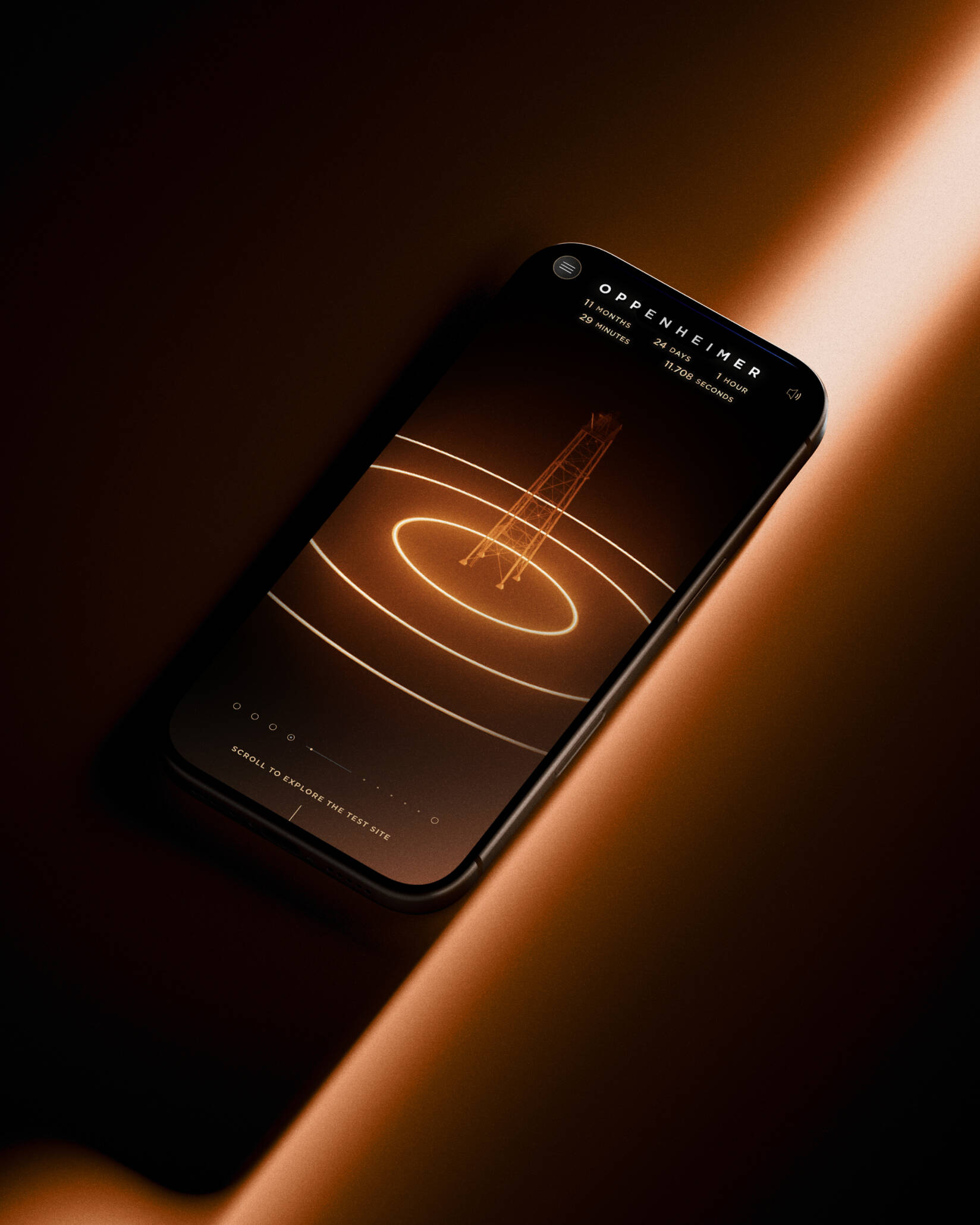
Scroll as Cinema
We treated scroll like a camera track. Early prototypes defined pacing and perspective. Camera paths were designed first in concept, then built in 3D, then meticulously tuned in development. Scroll resistance, easing, and track transitions were refined until movement felt intentional and cinematic.
The user controls progression, but the narrative remains deliberate. One defining sequence allows the user to climb the same tower as Oppenheimer, ascending slowly toward the device at the summit. As the camera rises, the glow intensifies. The desert stretches endlessly below. The world feels small. The consequence feels large.
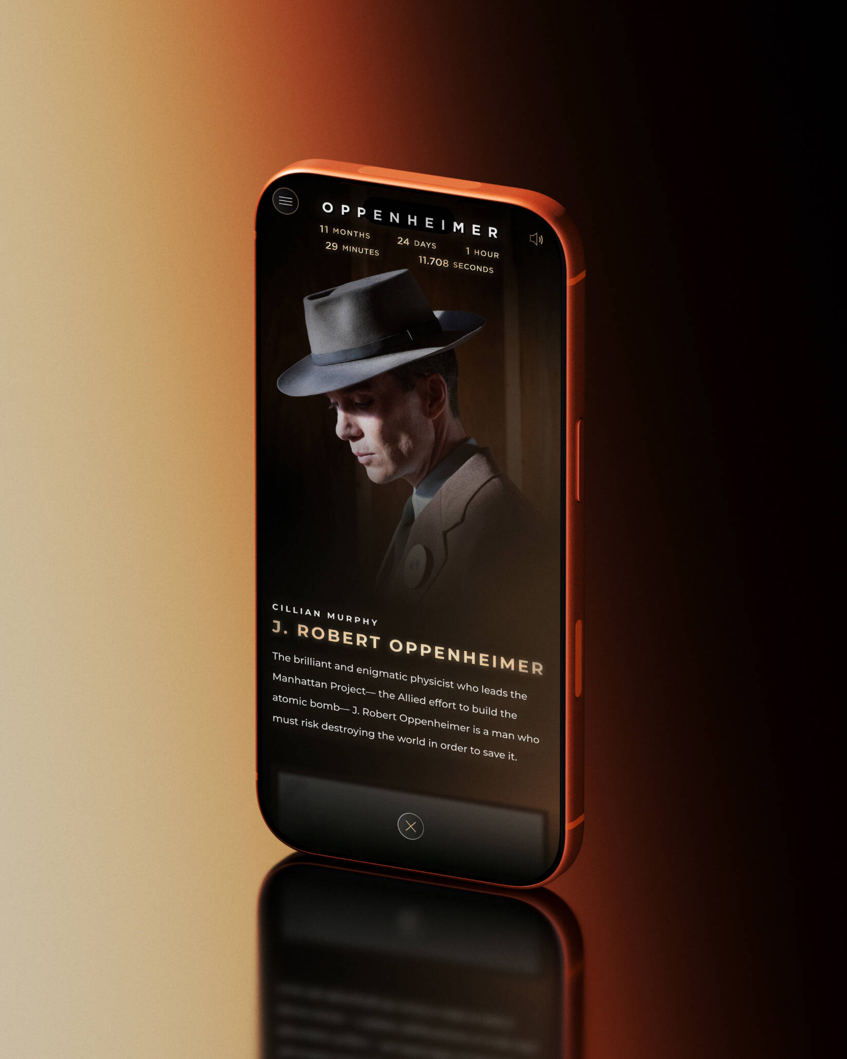
Continuing the narrative progression, once the user climbs the tower they reveal the gadget itself. Through scroll, they are able to dismantle the 3D diagram of the gadget itself and in doing so reveal am IMAX BTS featurette, relevant cast members, with exclusive photos and biographies, as well as ambient audio and custom-created SFX pulled from the feature, taking on a whole new level of detail and immersion.
The experience is linear by design. It preserves tension while allowing exploration within structure.
Atomic Detail and Craft
Every artifact ties back to the film’s visual and thematic language. The atomic form seamlessly transitions into a the blast radius, diagrams and plans informed the map. Light falloff and particle simulations reinforced the sense of scale and heat.
Design prototypes were built and refined before being translated into performant real time animations. Nothing existed without conceptual justification. Even texture overlays were calibrated to feel intentional rather than ornamental.
Polish was critical. Subtle lighting changes. Controlled glow density. Every element reinforces immersion and our themes.
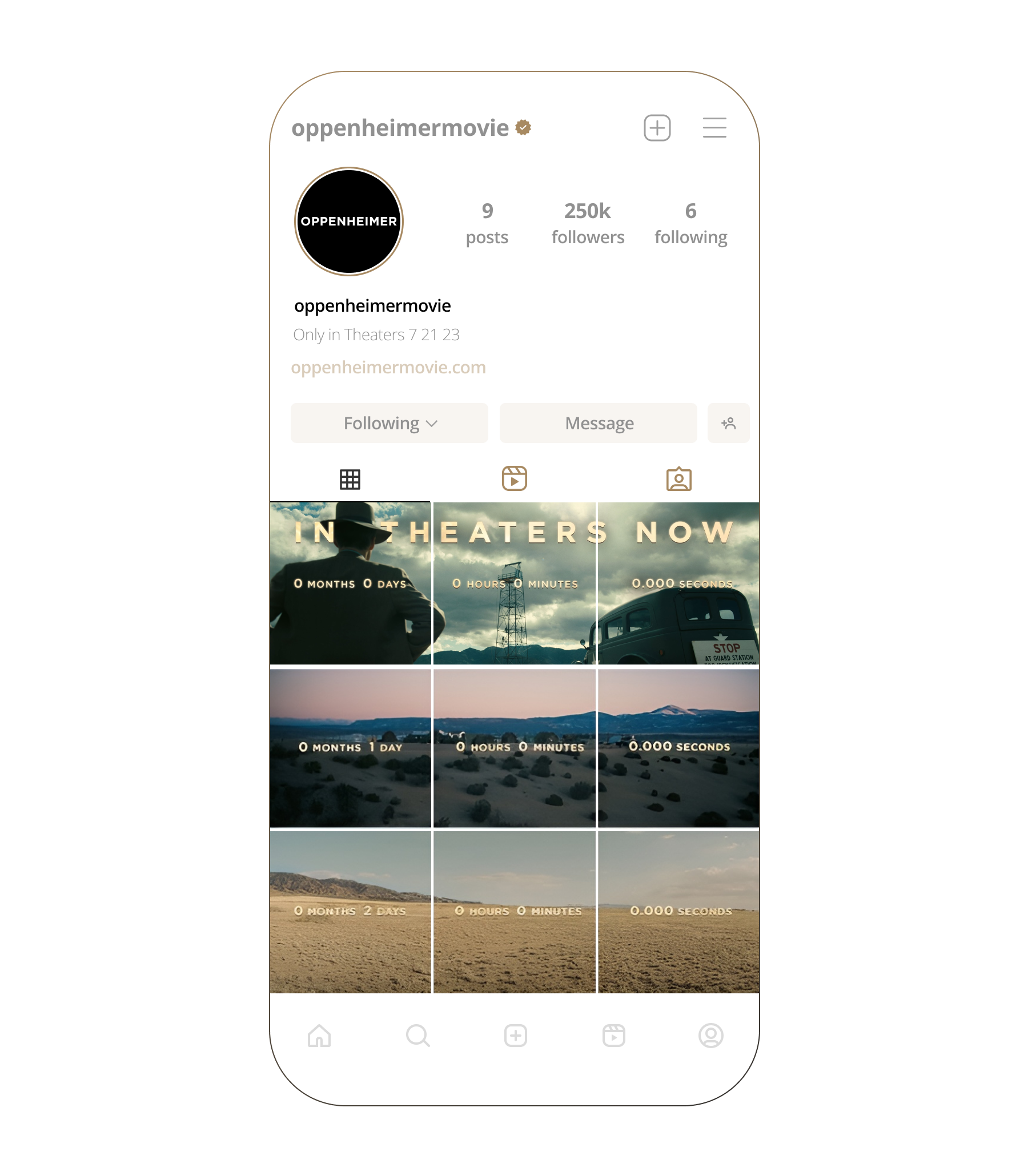
Social: Ignition at Scale
The visual system extended seamlessly to social. The Instagram grid became a construction site. A synchronized countdown unfolded in triptych format. With each post, Los Alamos assembled piece by piece. Roads paved. Structures rose. The tower materialized to reveal the “in theaters now” messaging.
The same fire system carried through social assets. Subtle embers for anticipation. Golden typography for prestige. Roaring flame for trailer drops and major reveals. The voice was deliberate and authoritative, reinforcing the historical significance, highlighting the scale of the ensemble cast, and the cultural weight of the release.
Results
At its core, this was a campaign about scale. Scale of ambition. Scale of consequence. Scale of craft.
By building Los Alamos in the browser, we turned promotion into participation, inviting audiences not just to watch history unfold, but to walk through it.
The campaign didn’t just support the cultural conversation, it helped lead it positioning Oppenheimer as a cultural event.
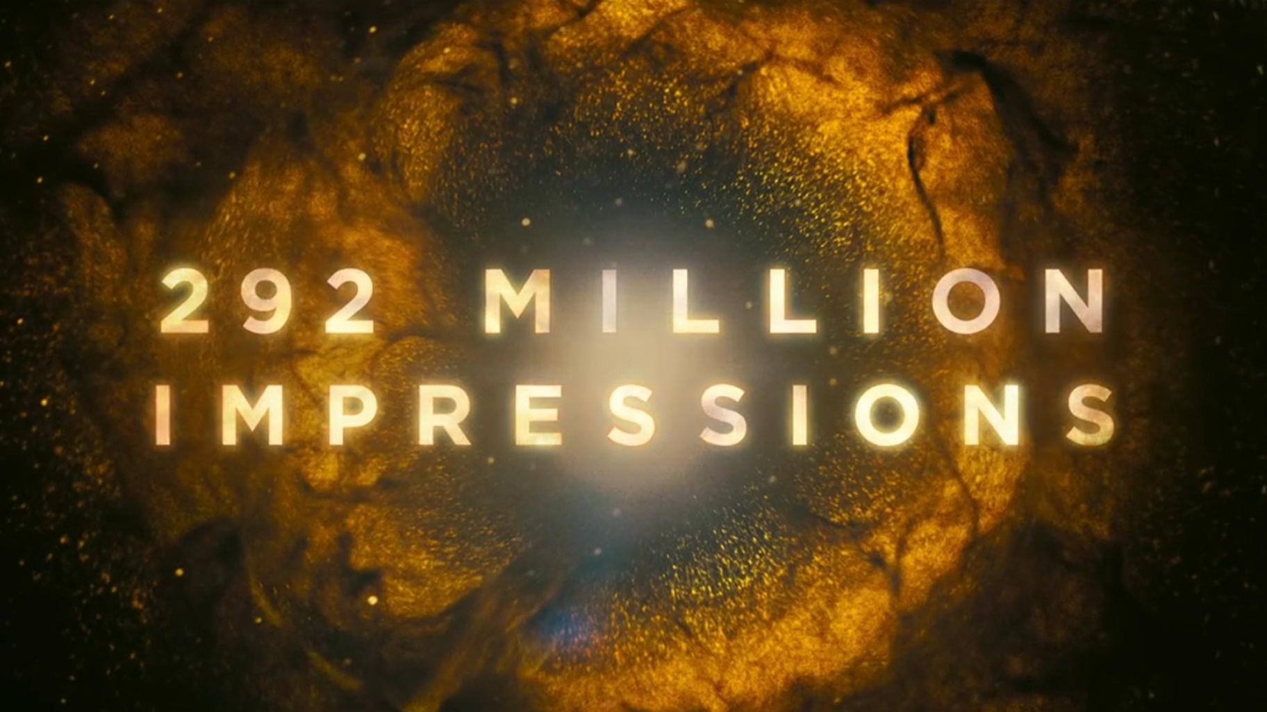
- 292M+ impressions
- Sustained engagement across digital and social
- Industry recognition including FWA Site of the Day and Clio Awards
Most importantly, the work translated the magnitude of the story into a digital medium with equal ambition. A city built from nothing. A spark turned into spectacle. Progress illuminated in gold, shadowed by fire.